White-Label Product & Auth0 Integration
Lead designer on a white-label superannuation platform serving 300,000 members across 5 client brands. Redesigned registration and integrated Auth0 for 250,000 members after a security incident. Governed the design system across all client experiences.
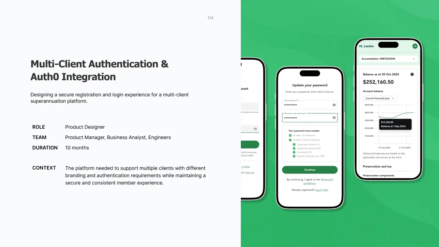
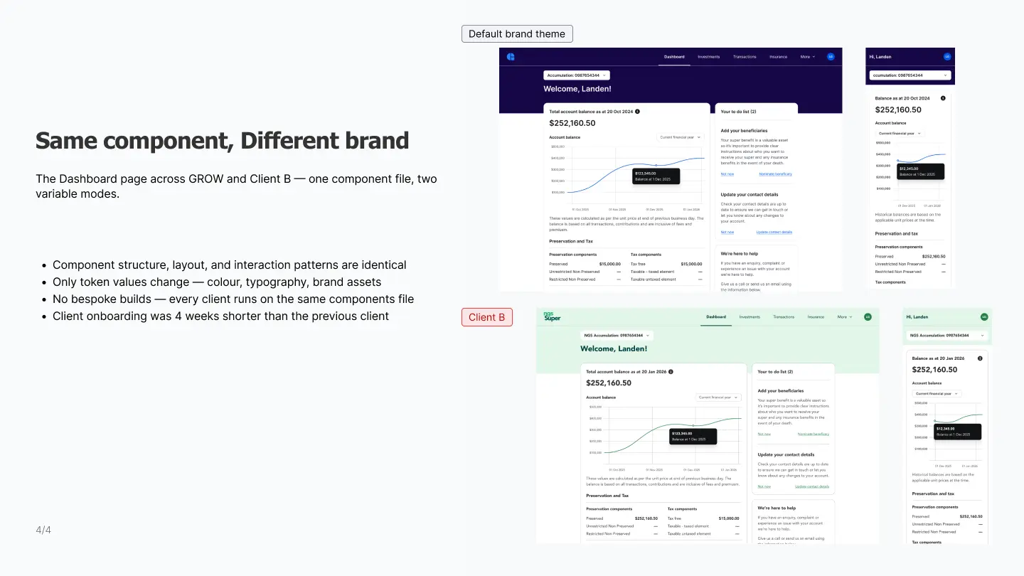
Grow runs a white-label superannuation platform. Each fund client gets a branded experience, all built on the same system. Clients included Vanguard Super, Australian Ethical, and NGS Super — 300,000 members combined.
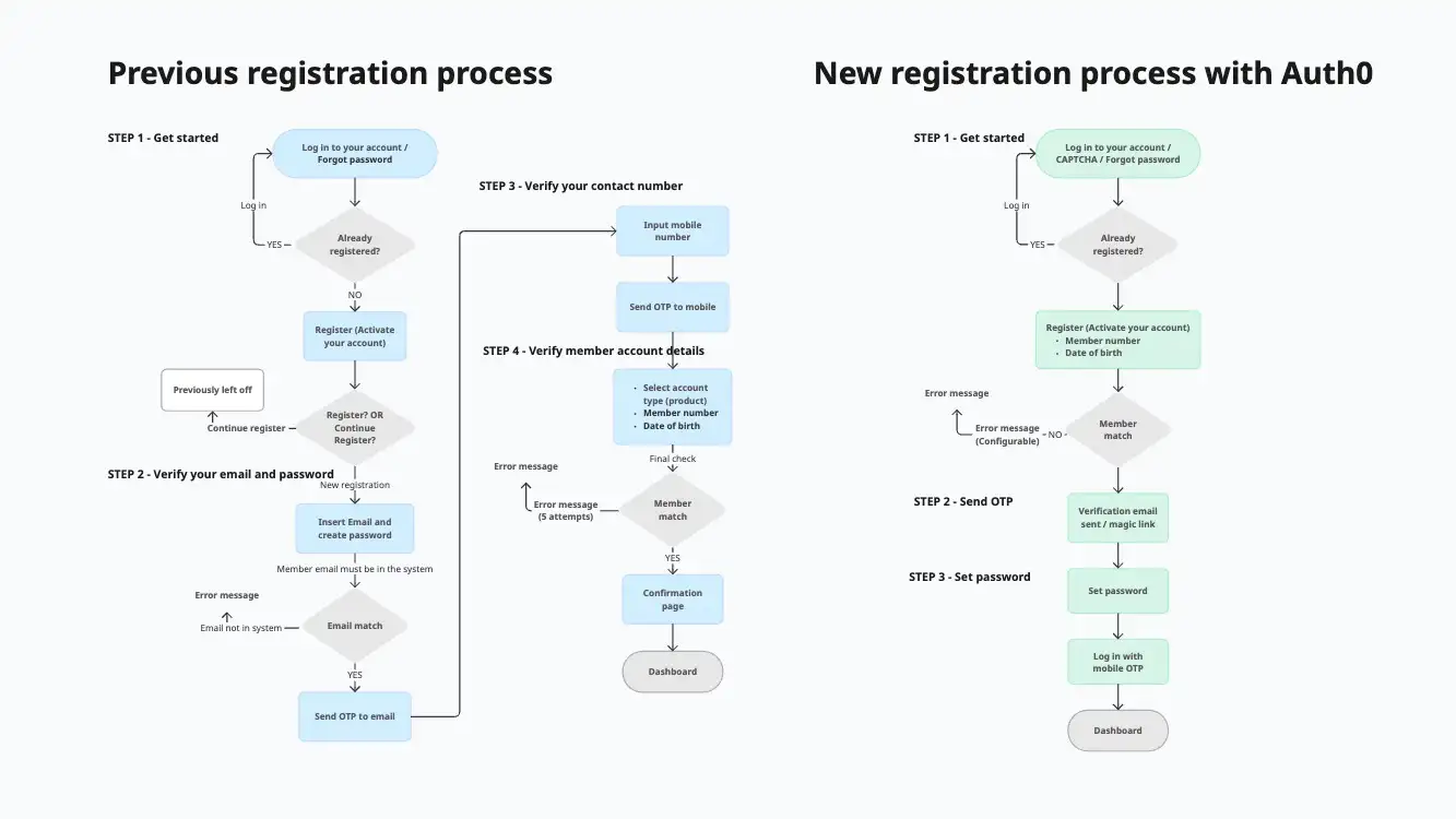
There was a security vulnerability found. No users were affected, but it forced us to act. The existing registration flow already had legacy issues, which generated avoidable support calls. We needed to integrate Auth0 as our identity provider, redesign the registration experience, and get sign-off from both clients.
Challenges
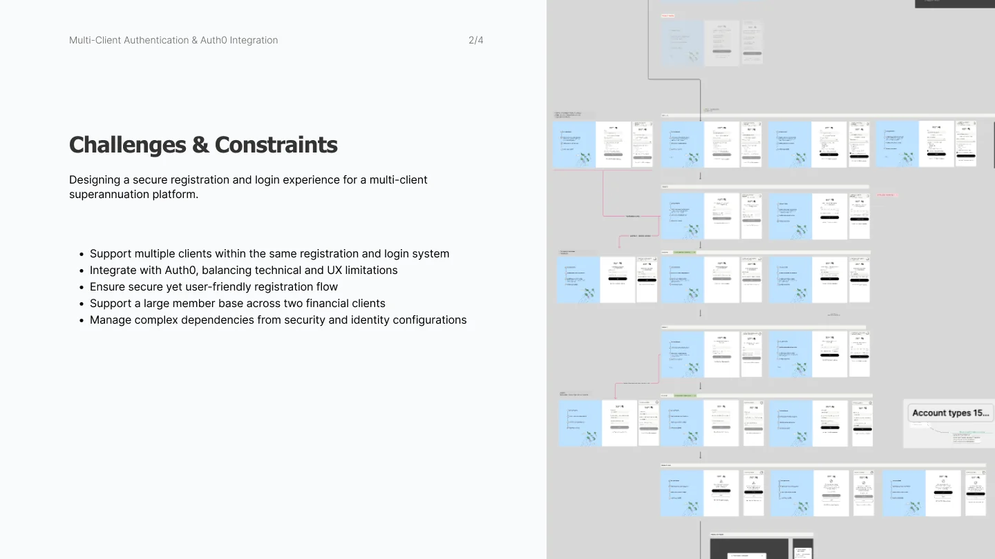
Auth0 limited what we could control
We couldn't customise everything. I mapped Auth0's boundaries early and focused on what we could control: error messages, system states, and reducing steps.
Pressure to ship fast after the security vulnerability
The security team wanted it fixed immediately. But rushing the registration flow for over 100,000 members at the same time — for the first onboarding client and the existing client — would create new problems, such as maintaining consistency. I pushed for shipping a secure baseline first, then iterating based on real support data after launch.
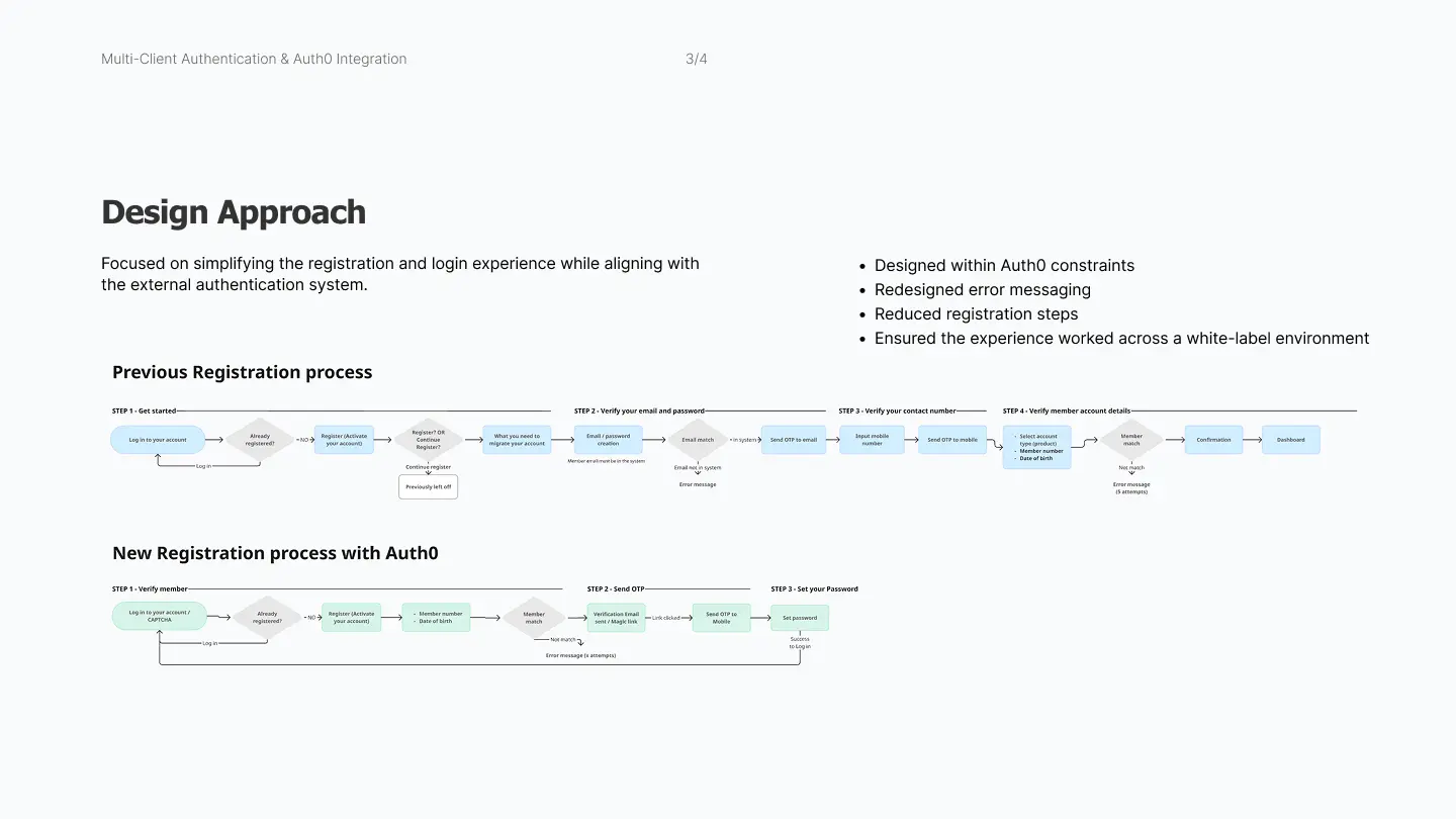
Auth0 Registration Redesign
I started by mapping Auth0's constraints and worked with the BA to document which steps we controlled and which were locked by the identity provider.
I reduced registration steps by combining identity checks.
I took security risk as a high priority. After launch, I tracked support patterns and added in-context guidance where members were getting stuck.
Impact
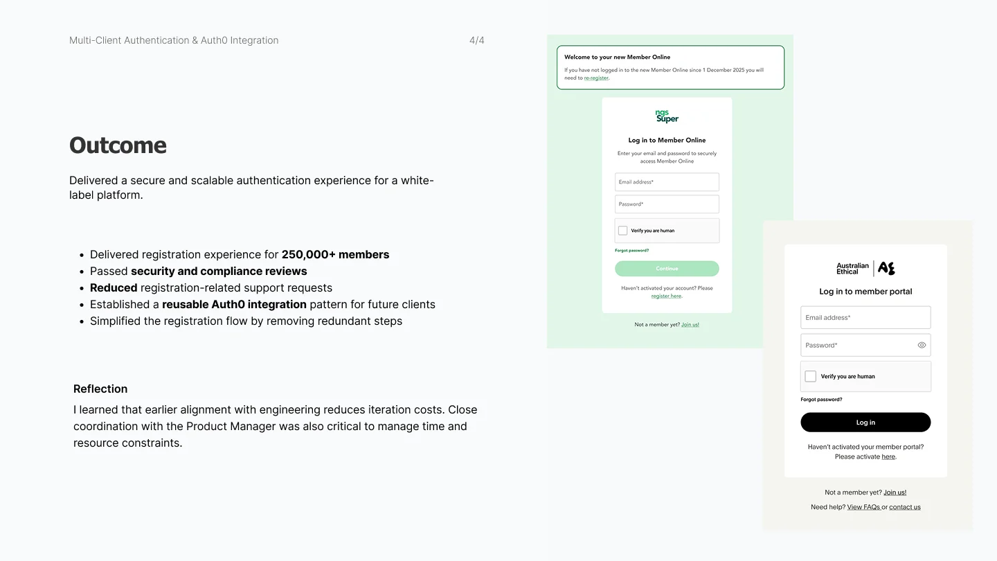
- Registration experience delivered for 250,000 members across 2 clients — passed security review without major redesign
- Support calls for registration decreased after simplifying the flow and adding in-context guidance
Reflection
Include engineers from day one. I mapped user flows before involving engineers. When I showed them, they flagged that some flows weren't possible due to the integration between Auth0 and our own system. We had to update the signed-off work. I haven't had that problem again.
Set boundaries for customisation early. White-label products fall apart when every client gets bespoke treatment. Clear rules about what can and can't change made the system scalable instead of fragile.
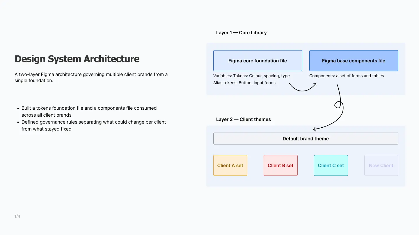
Design System Governance
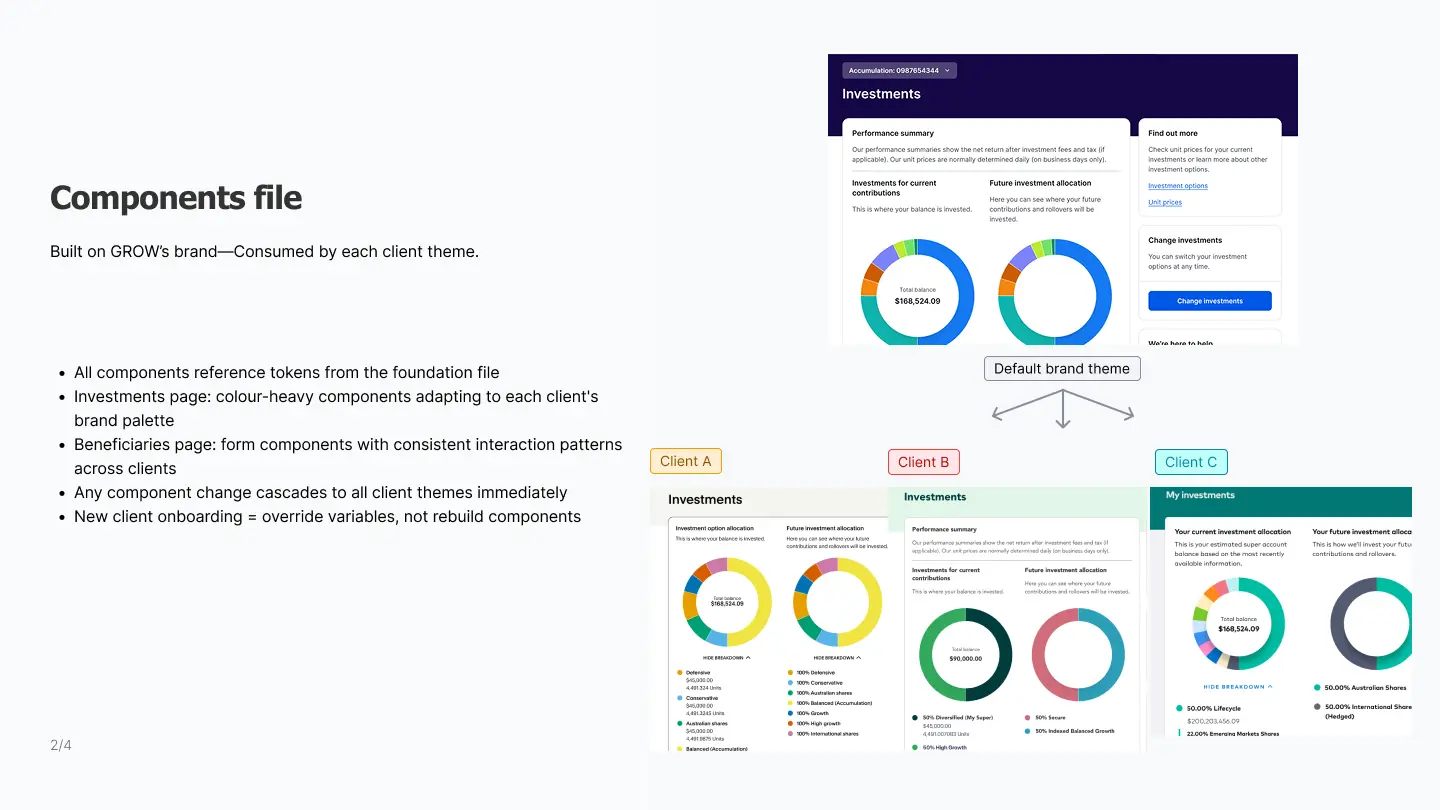
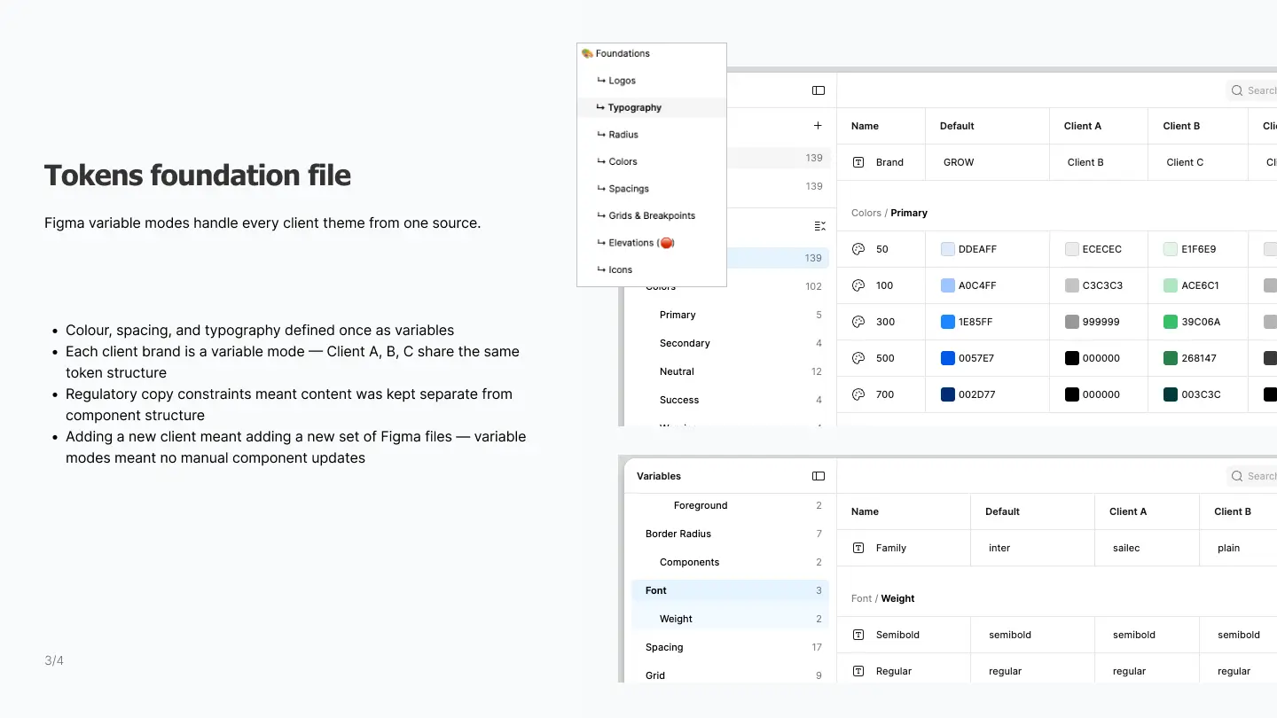
I governed the design system across five client brands — defining what could be customised and what stayed fixed across all clients.
I defined what could be customised — colour, typography, icons — and what stayed fixed across all clients. Content was the hardest constraint: each client had different wording requirements for regulatory reasons.
When clients or internal stakeholders pushed for bespoke changes, I assessed each request against scalability impact and pushed back with a standardised alternative where the request would add long-term maintenance debt.
Impact
- Design system governed 5 branded client experiences — fewer ad-hoc requests, faster onboarding of new funds
- Auth0 integration pattern reused for subsequent client onboarding — reducing redesign time
- Before a new client onboarding started, I created a single documentation framework linking Figma directly to copywriting and specifications. Previous onboardings had lost the source of truth — the client launched with minimal customisation requests as a result.
Research
Watch people work in their real environment. Usability testing showed how members interacted with registration. Contextual enquiry showed how call centre staff actually used the administration platform — a completely different side of the product. The member summary screen would never have come from a usability test on the member-facing screens. Different research methods reveal different problems.
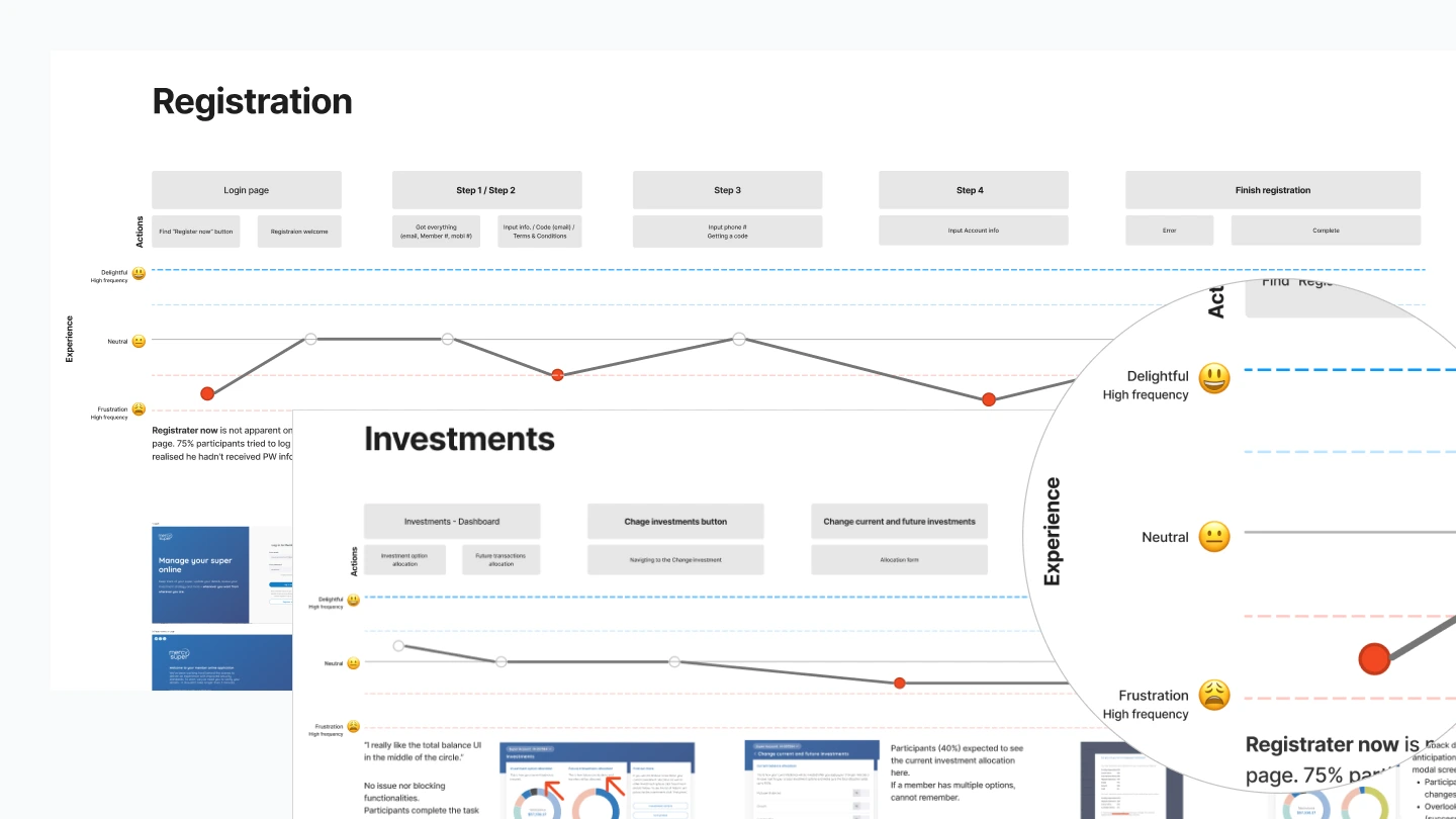
Usability testing
I ran 16 usability sessions using internal recruits — new employees who'd never seen the product. Findings were grouped by severity and fed directly into roadmap decisions.
Contextual enquiry
Separately from the member-facing work, I partnered with the other designer to conduct a contextual enquiry at a client site — observing how call centre staff used the internal administration platform during live member calls.
Staff were switching between 2–3 sections of the admin tool simultaneously — searching for a member in one screen, updating records in another, all while speaking to the customer on the phone. The cognitive load was invisible until I watched it happen in context. This wasn't a UI problem — it was a workflow problem.
Based on these observations, I designed a member summary screen — a single view surfacing the key information staff needed during a live call. It reduced page-switching and enabled faster, more confident member identification over the phone.